Should you use a dropdown list or a radio button field?It’s a question we get often. One we’ve addressed on the blog before. We still stand by our original claim that radio buttons are often more visually appealing and make it easier for users to scan through options. But there is a new consideration. We’ve since published the Form Conversion Report and, well…Radio buttons are among the top five bottlenecks. That doesn’t mean radio buttons are fading stars of the form-building show. But they may not always be right for center stage. The following questions and recommendations can help you decide when to use a radio button and when to opt for the alternative dropdown list.
1. Are people already familiar with the choices you’re offering?
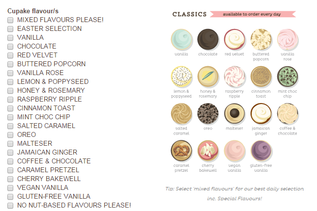
Most users won’t need to see side-by-side comparisons of days of the week or months of the year. Space-saving dropdowns tend to work well for lists of well-known choices. But it’s much easier to decide between seven slight variations of the same event or 12+ different cupcake flavors when they’re presented in side-by-side (or stacked) radio buttons:
2. Do you want to upsell your customers?
Use radio buttons. With a dash of promotional messaging and a dose of Conditional Logic, you can use these selections to take your relationship with customers further.
3. Are most of your viewers filling out forms on mobile devices?
The dropdown debate among marketers has become pretty intense. Some say dropdown lists are “almost always bad for the user experience.” Others tie them to a number: “Dropdowns only work when you’re presenting seven to fifteen options.” Nonsense.
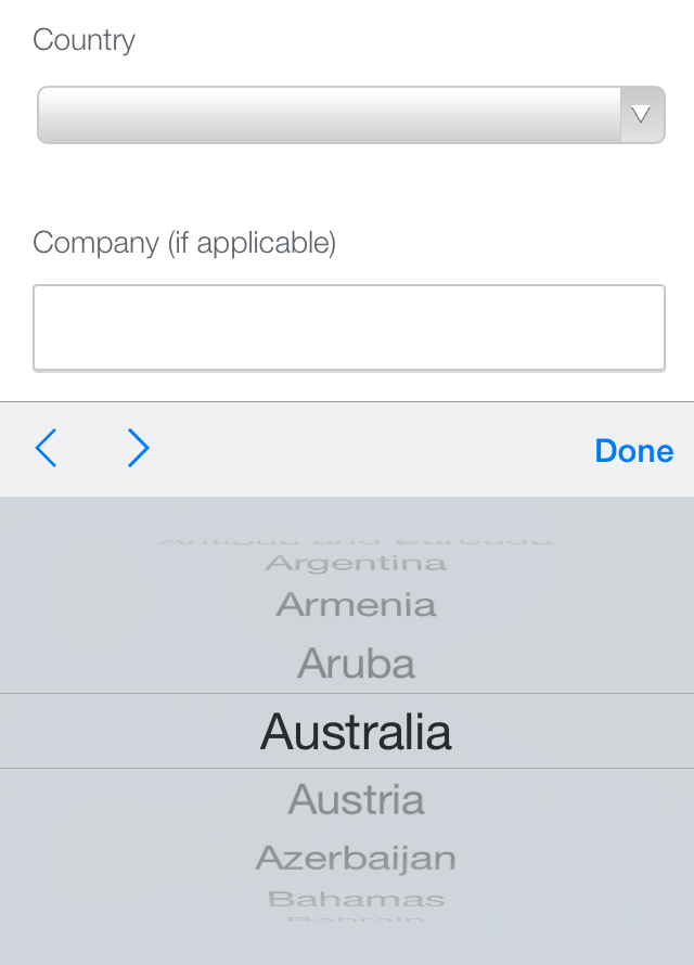
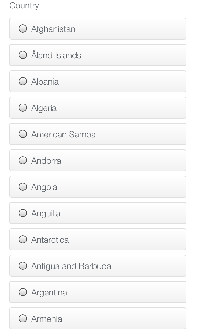
Those arguments don’t factor in smartphones and tablets, where it tends to be much easier to scroll through a dropdown than it is to swipe through a scrolling stack of, say, 246 radio buttons to find a country:
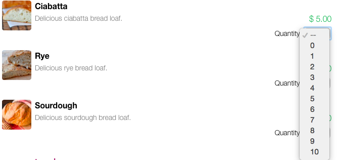
4. Is the choice you’re offering a simple one such as quantity?
Our vote is for the dropdown. Hands down:
5. Are you offering a strong incentive?
The average contest form has a conversion rate of 35%. That’s two-and-a-half times the average for the second-highest converting form type! People are usually willing to fill out more form fields—the average contest form contains ten of them—when there’s a prize to win. So dropdown lists can be a great way to collect more data while shortening forms for Facebook.
6. Do you need to find out which U.S. state people live in?
Few things are more attractive than a pile of 50+ radio buttons:

Nah. Just kidding. Use your form builder’s pre-filled lists feature to populate a dropdown menu.
7. Are you using a dropdown simply to save space?
That may not be the best method. You may want to consider multi-page forms, which show average conversion rates of 13.85%, compared with a 4.53% average for single-page forms. Forms spanning two or more pages also tend to include radio buttons that make it easier for people to scan and evaluate options.
8. Are you presenting multiple pricing options?
Radio buttons are usually the best way to go. Placed side by side, they can make it easy for users to comparison shop at a glance:
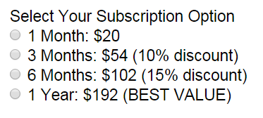
When stacked with Conditional Logic, radio buttons also can make it easier for people to choose from multiple payment methods. (Translation: You get paid faster. And more often, since this arrangement can increase conversion rates.)
9. What’s worked in the past?
Use form data to learn more about your customers, pinpoint problem areas in your strategy, and increase submissions with our powerful Conversion Kit.


